Navbar Components
Use these chakra-infused React sections to showcase key messaging, product highlights, and calls-to-action at the top of your site. Each section is thoughtfully designed, production-ready, and powered by Shadcn UI — so you can summon beautiful UIs into any React project with ease.
Inportant
Make sure to configure the @rasengan-ui registry into your components.json file.
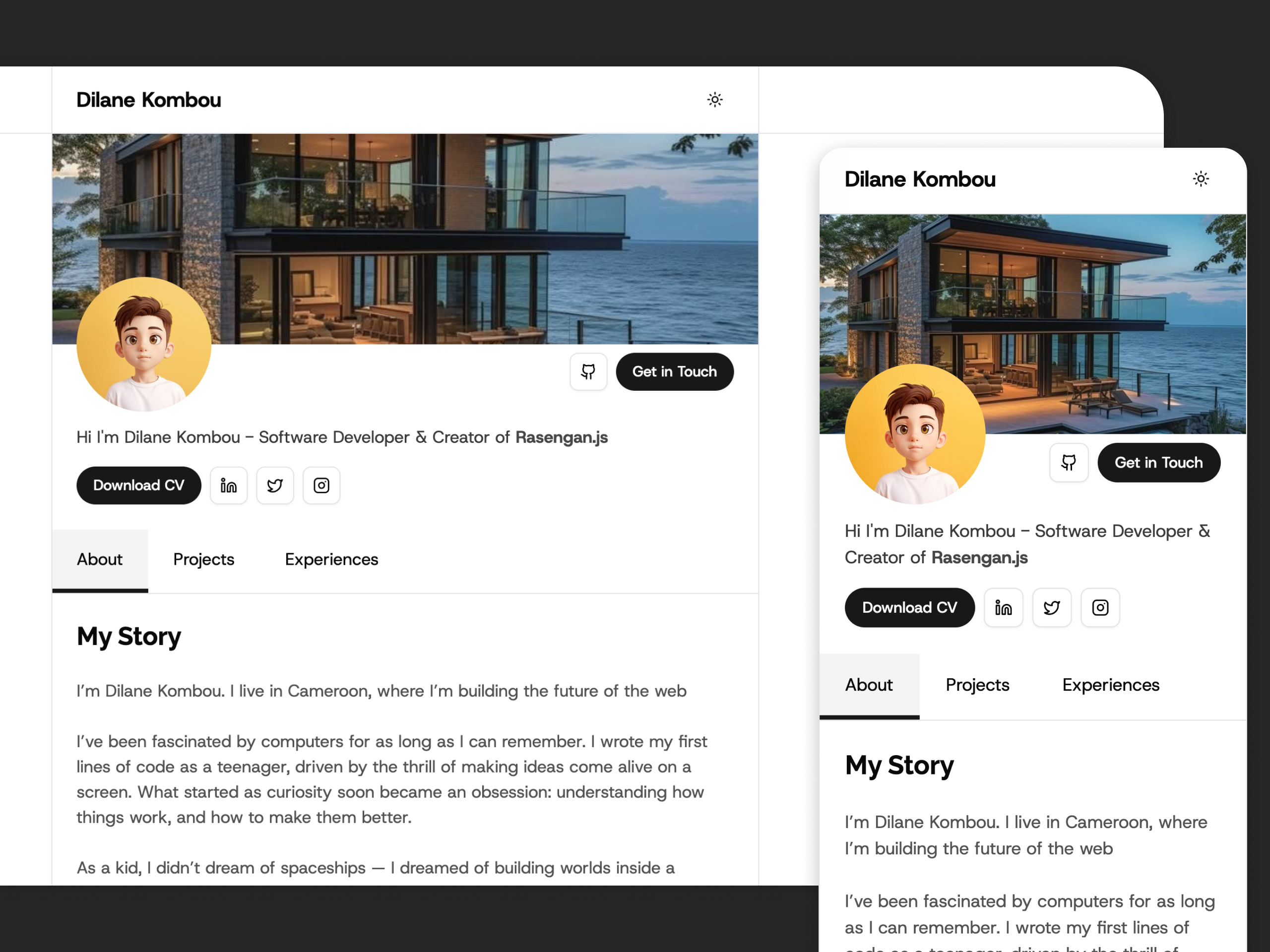
Navbar 01
bashnpx shadcn@latest add @rasengan-ui/navbar-01
Navbar with left text
Navbar 02
bashnpx shadcn@latest add @rasengan-ui/navbar-02
Navbar with centered text
Navbar 03
bashnpx shadcn@latest add @rasengan-ui/navbar-03
Navbar with right text
Navbar 04
bashnpx shadcn@latest add @rasengan-ui/navbar-04
Floating Navbar with medium border rounded
Navbar 05
bashnpx shadcn@latest add @rasengan-ui/navbar-05
Floating Navbar with full border rounded