Grid Components
Beautifully crafted lists to display items in a grid layout. Chakra-infused, responsive, and ready to drop into any React app — making it effortless for users to explore and interact with your content.
Inportant
Make sure to configure the @rasengan-ui registry into your components.json file.
Grid 01
bashnpx shadcn@latest add @rasengan-ui/grid-01
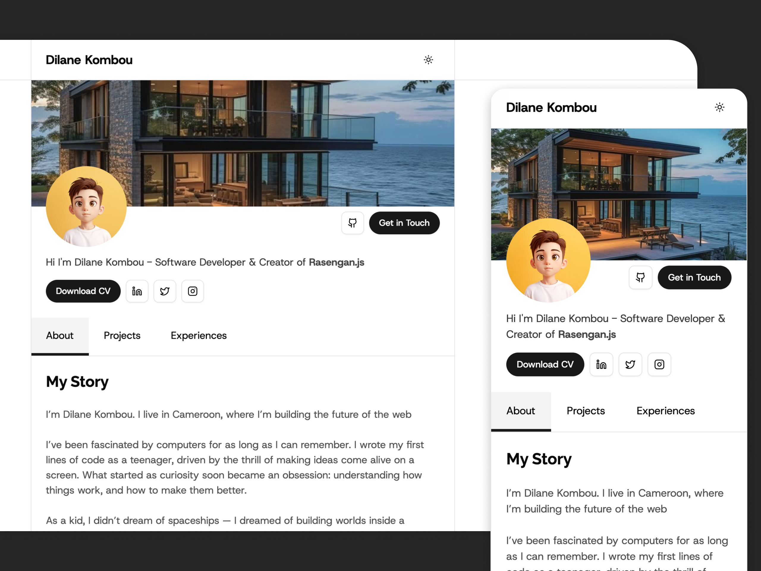
Grid contacts cards 1
Grid 02
bashnpx shadcn@latest add @rasengan-ui/grid-02
Grid contacts cards 2
Grid 03
bashnpx shadcn@latest add @rasengan-ui/grid-03
Simple cards list
Grid 04
bashnpx shadcn@latest add @rasengan-ui/grid-04
Images list
Grid 05
bashnpx shadcn@latest add @rasengan-ui/grid-05
Cards with shared borders